top of page
ePlane
ePlane
ePlane is an eCommerce platform designed to bring together buyers and sellers in the aerospace industry from around the world.
It enables straightforward transactions to be quickly and easily carried out online.
Visit ePlane
UI/UX Design | Marketing
Video editing | illustrations | Art Directing
ePlane is an eCommerce platform designed to bring together buyers and sellers in the aerospace industry from around the world.
It enables straightforward transactions to be quickly and easily carried out online.
Visit ePlane
UI/UX Design | Marketing
Video editing | illustrations | Art Directing
ePlane
Seawave
Sea wave is a project I created With an understanding of what the surfer needs outside the sea
The website combines surfboards & Accessories shop and
updated real-time magazine
UI/UX Design | Marketing | Art Directing
Seawave
Sea wave is a project I created With an understanding of what the surfer needs outside the sea
The website combines surfboards & Accessories shop and
updated real-time magazine
UI/UX Design | Marketing | Art Directing
Seawave
Sea wave is a project I created With an understanding of what the surfer needs outside the sea
The website combines surfboards & Accessories shop and
updated real-time magazine
UI/UX Design | Marketing | Art Directing
Seawave
Sea wave is a project I created With an understanding of what the surfer needs outside the sea
The website combines surfboards & Accessories shop and
updated real-time magazine
UI/UX Design | Marketing | Art Directing
ePlane
ePlane
ePlane
ePlane
ePlane
ePlane is an eCommerce platform designed to bring together buyers and sellers in the aerospace industry from around the world.
It enables straightforward transactions to be quickly and easily carried out online.
Visit ePlane
UI/UX Design | Marketing
Video editing | illustrations | Art Directing
ePlane
Seawave
Sea wave is a project I created With an understanding of what the surfer needs outside the sea
The website combines surfboards & Accessories shop and
updated real-time magazine
UI/UX Design | Marketing | Art Directing
Seawave
Sea wave is a project I created With an understanding of what the surfer needs outside the sea
The website combines surfboards & Accessories shop and
updated real-time magazine
UI/UX Design | Marketing | Art Directing
Seawave
Sea wave is a project I created With an understanding of what the surfer needs outside the sea
The website combines surfboards & Accessories shop and
updated real-time magazine
UI/UX Design | Marketing | Art Directing
More Than Templates: A Custom Reporting System
My Role
Product Designer
Year
2023
Company
BeProfit
CONTEXT
About BeProfit
BeProfit is a SaaS tool that helps eCommerce businesses track and optimize profitability. By aggregating data from multiple platforms (like Shopify, ad networks, and shipping providers), it gives a clear view of true profit margins, helping users make informed decisions to grow smarter.
At BeProfit, I was responsible for leading the UX of core features.

CHALLENGE
Building Custom Reports to Fit Needs
The old reporting system was too basic—limited features, fixed templates, zero flexibility.
So we tore it down and rebuilt it. A new, powerful, user-first reporting flow that adapts to how users actually work—flexible, intuitive, and fully customizable.
Users struggled to create reports tailored to their needs. The system was rigid, unintuitive, and didn’t offer the flexibility they expected. Some users wanted to start from a pre-made template, while others preferred building from scratch — but both groups found it hard to reach their goals.
🔹 Rigid templates
🔹 Limited functionality
🔹 Lack of customization
🔹 Inability to handle diverse user needs

old custum report main page design

Users Feedbacks
To better understand user preferences, we surveyed a group of 150 active users, asking
how they prefer to create reports.
The responses showed a clear split:
🔹 58% preferred building reports from scratch
🔹 42% preferred using predefined templates
This mix of frustration and insight became the foundation for our new solution — a flexible, user-driven experience that adapts to different workflows and needs.
GOALS
1
Empower users to create reports their own way
2
Design a clear, intuitive, and flexible report flow
3
Increase adoption and reduce friction in reporting
SELUTION
I redesigned the report creation experience around user flexibility. The process begins with a clear choice: start from a template or build from scratch — based on user feedback showing both approaches were equally needed.
The new flow was designed to be modular and intuitive: users can add, remove, and reorder metrics, preview the results in real-time, and save reports with just a few clicks. The layout, controls, and interactions were optimized to reduce friction and allow users to focus on insights, not interface.
This redesign gave users true ownership over their reporting process — and significantly reduced support tickets related to report creation.
The User’s First Touchpoint
Since user preferences were relatively balanced, I wanted to ensure that creating a new report, editing one, or viewing an existing report would be equally easy to access and follow the same flow.
.png)
Castum Report Starting point
Defining the Report Layout Through Metrics
The report-building flow was intentionally designed to start from the top menu, reinforcing clarity and structure. Users begin by selecting metrics — each one represented as a column in the final report. Two core metrics are fixed to ensure consistency across reports, while the rest are fully customizable.
This modular approach allows users to tailor reports precisely to their needs, while still maintaining a consistent data foundation — giving advanced users the freedom to experiment, and new users a simple path to start with.
.png)
Bulk Report – starts by adding core metrics from the top menu.
Once metrics are selected, users gain full control over the report layout — they can drag to reorder columns, remove fields they don’t need, or add summary metrics like totals and averages. The interface was designed to be frictionless and responsive, so users can iterate quickly and build exactly the report they need, without starting from scratch each time.
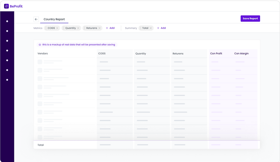
Users have full control to adjust the structure after selection
See it on Action

This redesign transformed a rigid process into a streamlined, user-driven experience. It reflects my approach to product design: listen deeply, simplify boldly, and always design for clarity and control.
bottom of page