top of page
ePlane
ePlane
ePlane is an eCommerce platform designed to bring together buyers and sellers in the aerospace industry from around the world.
It enables straightforward transactions to be quickly and easily carried out online.
Visit ePlane
UI/UX Design | Marketing
Video editing | illustrations | Art Directing
ePlane is an eCommerce platform designed to bring together buyers and sellers in the aerospace industry from around the world.
It enables straightforward transactions to be quickly and easily carried out online.
Visit ePlane
UI/UX Design | Marketing
Video editing | illustrations | Art Directing
ePlane
Seawave
Sea wave is a project I created With an understanding of what the surfer needs outside the sea
The website combines surfboards & Accessories shop and
updated real-time magazine
UI/UX Design | Marketing | Art Directing
Seawave
Sea wave is a project I created With an understanding of what the surfer needs outside the sea
The website combines surfboards & Accessories shop and
updated real-time magazine
UI/UX Design | Marketing | Art Directing
Seawave
Sea wave is a project I created With an understanding of what the surfer needs outside the sea
The website combines surfboards & Accessories shop and
updated real-time magazine
UI/UX Design | Marketing | Art Directing
Seawave
Sea wave is a project I created With an understanding of what the surfer needs outside the sea
The website combines surfboards & Accessories shop and
updated real-time magazine
UI/UX Design | Marketing | Art Directing
ePlane
ePlane
ePlane
ePlane
ePlane
ePlane is an eCommerce platform designed to bring together buyers and sellers in the aerospace industry from around the world.
It enables straightforward transactions to be quickly and easily carried out online.
Visit ePlane
UI/UX Design | Marketing
Video editing | illustrations | Art Directing
ePlane
Seawave
Sea wave is a project I created With an understanding of what the surfer needs outside the sea
The website combines surfboards & Accessories shop and
updated real-time magazine
UI/UX Design | Marketing | Art Directing
Seawave
Sea wave is a project I created With an understanding of what the surfer needs outside the sea
The website combines surfboards & Accessories shop and
updated real-time magazine
UI/UX Design | Marketing | Art Directing
Seawave
Sea wave is a project I created With an understanding of what the surfer needs outside the sea
The website combines surfboards & Accessories shop and
updated real-time magazine
UI/UX Design | Marketing | Art Directing
Multishop View – Smarter Management for Multiple Stores
My Role
Product Designer
Year
2023
Company
BeProfit
CONTEXT
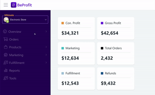
About BeProfit
BeProfit is a SaaS tool that helps eCommerce businesses track and optimize profitability. By aggregating data from multiple platforms (like Shopify, ad networks, and shipping providers), it gives a clear view of true profit margins, helping users make informed decisions to grow smarter.
At BeProfit, I was responsible for leading the UX of core features.

CHALLENGE
Meeting the Needs of Larger Merchants with
Smart Multishop Control
Key Design Points:
-
Select preferred shops for comparison.
-
Highlight the logged-in shop as a reference point.
-
Provide visual cues to indicate users are viewing multi-shop data.
-
Facilitate easy switching between shops within the platform.
-
Handle promotions and potential currency differences among shops.
-
Offer a clear exit point from the multi-shop view.
-
Address limited support for specific app pages or metrics in the initial launch.
-
Highlight the feature for users who haven't yet added a second shop.

GOALS
1
Improve communication and data transparency for users.
2
Create a seamless and intuitive user experience flow for multi-shop navigation.
3
Increase user engagement with the multi-shop feature and encourage adding more shops.
Following a strategic decision to focus on larger merchants — many of whom operate multiple stores — it became clear that the old system, which only supported single-store management, no longer met user needs.
SELUTIONS
1. Menu Navigation and View
By default, the logged-in shop name is displayed within the side menu.
A dropdown menu option allows users to access all shops under their workspace.
Users can select and unselect desired shops for comparison using intuitive checkboxes.
A clear "Multi-shop Mode" indicator visually confirms the user's viewing context.
A simple and easily accessible exit button allows users to return to the single-shop view.

Behavior Document for R&D
2. Compare Shops Page
After conducting several trials and user tests, I found that the optimal layout for the table is to organize it with shops listed by row and metrics by column. This configuration proved to accelerate data retrieval, as it aligns with the natural scanning patterns of the
eye, making it faster and more intuitive for users to find the information they need
compared to other layouts I tested.

Scrolling Areas
I designed the table with both horizontal and vertical scrolling to enhance user comfort and efficiency when viewing and scanning data. This dual-scrolling functionality helps reduce search times and minimize user frustration by providing easier navigation and quicker access to information.


bottom of page